Dashboards and reports
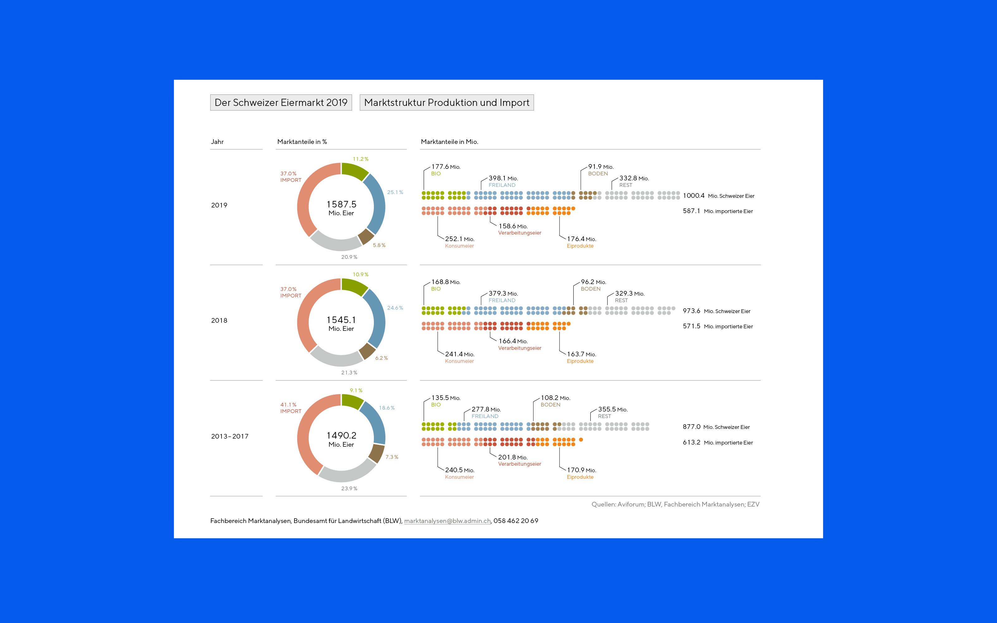
For agile organisations, understanding data and information is an essential task to stay competitive. Visualisations support decision-making, enable monitoring of current developments and even help with a shared vision. The content can provide a retrospective view of the past, the current state or a strategic outlook for the future. Figures can be translated into data visualisations and diagrams. Texts are made understandable at first glimpse through infographics, illustrations or icons. In addition, a clear graphic layout creates a logical and goal-oriented structure.
Do you have a strategy that you want to visualize? Or do you want to make numbers easier to understand? Contact us.
What is a dashboard?
The word dashboard has its origin in the car display and contains a representation of data relevant to the driver, which comes from various data sources. From the visual translation, drivers can make important decisions for the traffic within seconds. The same principle applies to any personalized dashboard, which in today's world provides decision-makers all important data at a glance. In this context, business figures are referred to as KPI or Key Performance Indicators. The characteristic of dashboards compared to other visualisations is that they are usually a collage of different types of diagrams in a very compact space.
What is an infographic annual report?
In the annual report or business report, an organisation presents the results of the past year. The report documents all important events and developments in a multi-page print publication. For certain topics, it is important to follow legally prescribed design guidelines. Other parts of the report, however, allow enough leeway to use an infographic approach to reach a larger audience. An audience that is interested in the data stories, the emotions and the attractive communication of the information. These infographic annual reports can be not only print products but also exciting interactive websites.
What are real-time data APIs?
Real-time data is data that is retrieved and processed with the least possible time delay, so that users can work with very up-to-date figures. Such data is particularly interesting for the creation of dashboards, meaning digital overviews with different data sources. Mostly, real-time data is integrated via an API(a programming interface) into a digital product that takes over the interpretation of the data. Today, interactive visualisations that enable decisions and insights in a matter of seconds offer great potential.
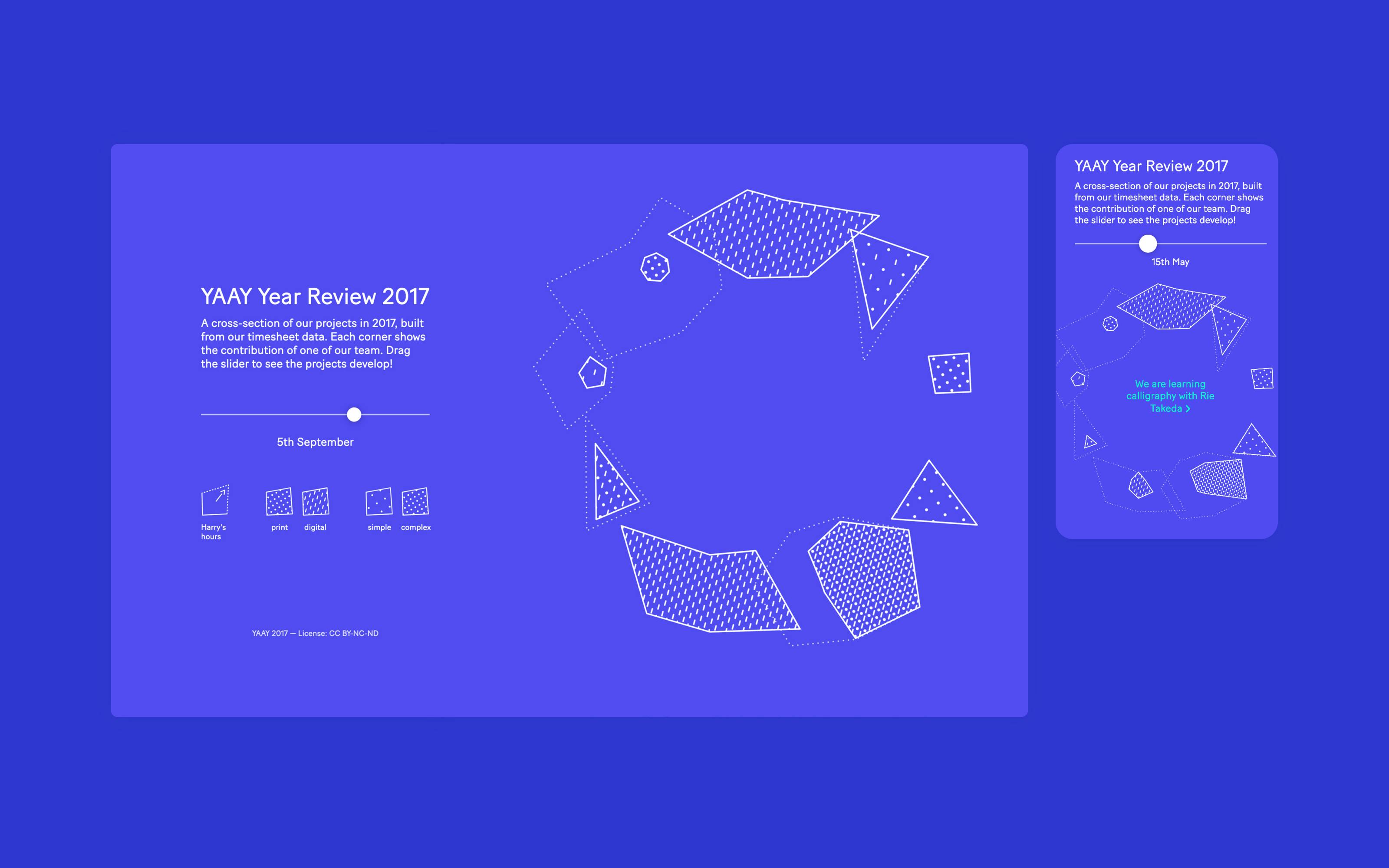
For example, we used to display a wide variety of real-time data on the website at YAAY.
What is a Visual Management Summary?
An executive summary (or management summary) is a summary of a longer piece of content. This content is summarised textually in such a way that readers can quickly gain an insight and overview without having to read all the content in full. The Superdot approach to Management Summaries is that we not only summarize the content textually, but also visualize it. Interrelationships, patterns and nesting between content points are thus even more quickly apparent and ensure greater efficiency. With a good design system, it is also possible to create templates that facilitate the preparation of management summaries.
Contact us for a free consultation and discover the potential of a management summary design for your business and content.
What is a big picture?
A Big Picture is the overall picture of an organisation, a project or an issue. It shows the important connections and patterns. The creation of a Big Picture is an effective tool for bringing visions, goals and strategies visually closer to people. The basic principle of a Big Picture is a compilation of all relevant content, which is increasingly condensed and structured into an information architecture in an iterative process.


