Data visualization and charts
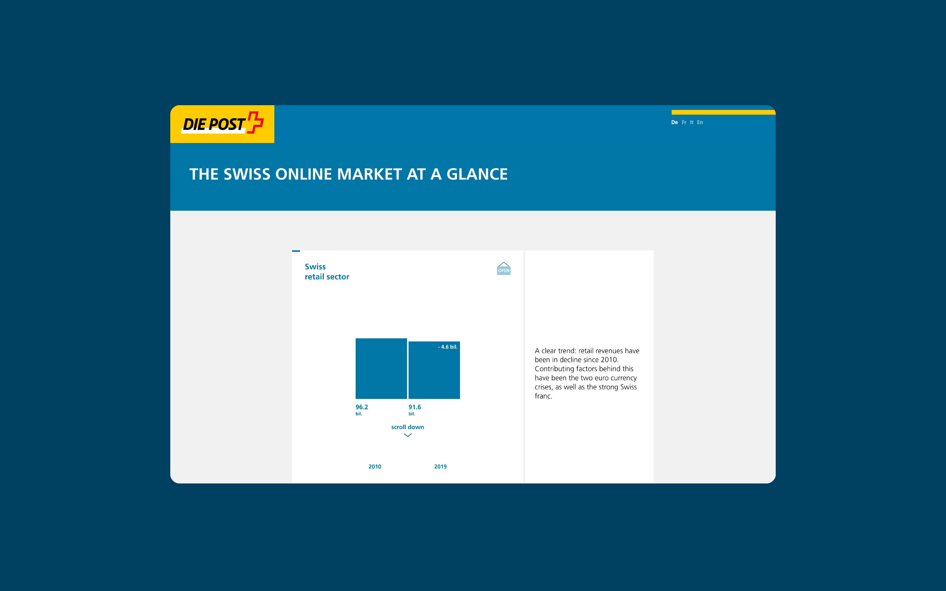
Data visualizations and charts can present and communicate complex data in a way that is easy to understand. The data sets used for this purpose can comprise a combination of numbers, text, categories, time-based data or geographical information. From commonly known charts to spectacular data visualizations, there are many forms of presentation. When deciding how to present something, the data types, the central story, the target audience and the communication medium all play an important role.
Contact us for a consultation on the potential of data visualization in your business.
What is data design?
In contrast to the terms data visualization and chart, data design refers to the creative process it takes to create visually appealing data visualizations and good charts. In this process, the data is first analyzed, the desired focus defined, and a suitable visual form found depending on the target audience and communication medium. For good data design, simply selecting the “right” chart type is not enough. Good data design works with a wide range of visual aspects of human perception.
Darjan Hil and Nicole Lachenmeier from Superdot impart their know-how in the field of data design in the degree program“Data Design & Art” at HSLU
What are innovative charts?
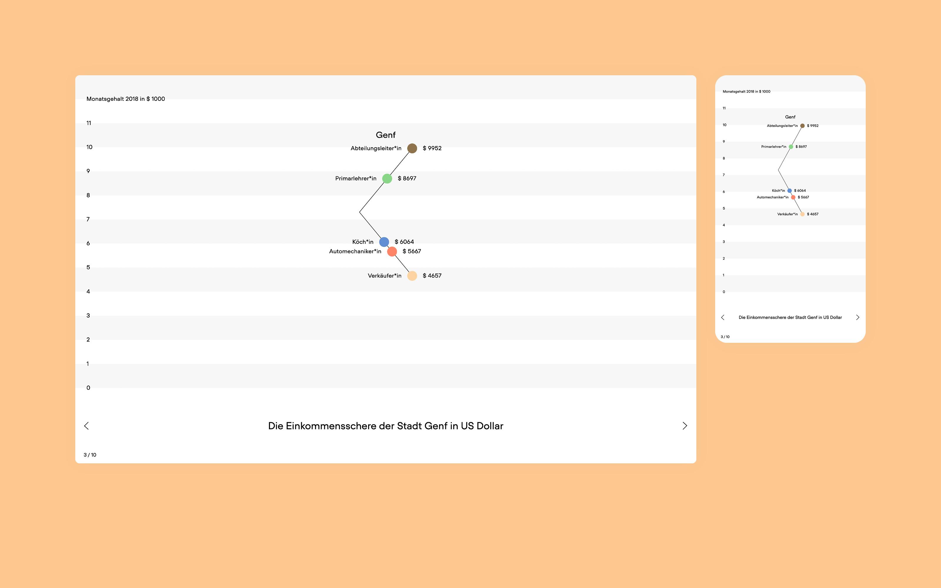
There are several widely used chart types, such as pie charts, bar charts or line charts. They are simple to create and easy to interpret. The downside is that because they are ubiquitous, they generate little attention and can seem boring. An alternative is to develop innovative charts that can convey data in new and visually surprising ways. New chart types can be a recognizable branding element of a design system.
Read the article about the «scissor chart» developed by Superdot
What is data storytelling?
When communicating data, data storytelling means embedding visualization in a narrative. Language is used to draw the target audience’s attention to the most interesting connections in a graphical representation and to show the context of the visualization. The trend of data journalism makes it clear how visualization and storytelling can go hand in hand. Depending on the project, visualization and storytelling can be combined and weighted differently.
What are interactive data visualizations?
Digital media are based on the interaction of users with data via a user interface. With their development, the field of interactive data visualization also emerged. The user can change data parameters such as different years and thus explore the data through observing changes in the visualization. Large amounts of data can thus be easily experienced and accessed interactively by the user. Even on small screens, large amounts of data can be displayed in a graphically appealing way and quickly interpreted.
What is mapping?
Mapping is the representation of geographic information. The geographic map is one of the oldest forms of data visualization. A map illustrates abstract, spatial data and spatial relationships. Other information can also be mapped. A common example of mapping non-geographic data is the representation of relationships as networks. However, other facts such as organizational structures, corporate strategies, production processes and much more can also be represented as a map.
What are data visualization tools?
There are many data visualization tools - and new ones are added almost daily. They differ in function, price, technology and in their range of selectable visualization types. The palette ranges from classic office applications like Excel and PowerPoint, to business intelligence tools like Tableau, to free online tools like RAWgraphs and JavaScript libraries like D3.js. When choosing a tool for data visualization, it is important to consider the desired visualization type and publication media.
In the “Data Visualization Catalogue” you will find an overview of different chart types and some tools they can be created with.


